Wednesday, December 9, 2009

Catch up on my reading


Long overdue, read-n-respond to last few readings, drive-thru style.

#5: Directed Storytelling

I was not quite sure about this one for the first few paragraphs. There was something clunky about the way the author was structuring things as simple as sentences, grammar; almost as if a translation program was in use. Things evened out quickly, though, and this is what I gleaned from the article.

Directed storytelling is a quick-interview process used to put some depth into the design of communication out of a designer's experiential home turf. 3 people (at least) participate:
  1. a storyteller (the one who talks about something)
  2. the leader (the asker of leading questions)
  3. documenter (someone who jots stuff down on stickie-notes)
The purpose is to get inside the feelings and experience of the user/subject without spending weeks or months directly immersed in their situation, to the end of giving a design effort intended for the subject's audience a core set of concepts/themes around which to hang all other aspects of the design. When time and money are in short supply, this quick method provides a way to accomplish what long-term, well-funded efforts do over the course of months of contextual placement and observation.

The usefulness of this for something like our term-long thesis projects is pretty evident; we had something like 7 weeks to pull off some pretty ambitious stuff, and we are all poor college students. A pen, a pad of post-its, and a couple of friends is something we can muster up. I did actually use something like this method in my own project. I conducted written surveys of parents and faculty at the school, asking the kind of open-ended, journalistic questions mentioned in this article as part of the directed storytelling method. I also am constantly interfacing one-on-one with people in the halls, and made ample use of the opportunity to gather more information that way, too. Even though I am part of the Cedarwood Community, I am not a prospective parent, so I had to ask some questions to get info that was beyond my realm.

#6 + 7: Conveying Emotion Through Design/Personas; Practice & Theory

I read this same Sagmeister piece two years ago in art 225. It reiterates his "touch the heart" theme, a concept he seems very focused on, and good at accomplishing. The lesson of the piece is that all the technical wizardry and regimented obeisance to typographical doctrine, all the high style and worship of pristine grids, is just empty surface gloss if the thing(s) designers create have no heart, no human emotional base as their core. He stresses finding and using your voice in design, bringing in your "personal" to connect with others' "personal". Starting there makes sure the ground you're planting the rest of your design in is fertile enough to produce an emotional harvest for the audience. A side note: I found the amputation aspect of this piece certainly emotionally gripping, but not in the sweet, nostalgic way Sagmeister seems to. Just saying.

The Personas piece was to me the most confusing and densely rambling of the readings we were assigned. I gathered the central idea early on that creating fake people and filling out their lives with details and experiences is a way to create "models" toward which you could direct and focus design efforts easily enough. But it was a good way into the article before it became clear (did it though?) whether this was a method (like directed storytelling) or a program (a computer application) used to generate personas. It was mentioned that method was patented, adopted by other organizations; it was always spelled with a capital "P", as in the name of a product or licensed thing.

A marked difference between this and the directed storytelling piece: I wanted a little more information out of the latter, and the former went on and on and on. No doubt this is an interesting and effective procedure for designers, especially working as a team. But it's big, takes lots of time, a whole 'nother staff of people just to "raise" these Persona kids. None of which we, as students in this class, have time or money to do. It was hard enough for me to find the time just to read this piece...

#8: Intro + Fwd/Chp. 1 "How to Be a Graphic Designer Without Losing Your Soul"

This book (our assigned text for the class) is really, at the risk of sounding banal and clicheed, a very charming and personal account of the human side of being a designer in today's world. Shaughnessy makes clear that there are a plethora of other design books out there, and that his is but one admittedly flawed voice speaking on the subject. But it is that very flawed nature that exposes the individual aspect of this testimony: it's uniqueness is rendered twofold by clearly sounding like an individual designer relating his experiences, and by being a comprehensive walk-through of the things they don't necessarily teach you in art school about choosing, deciding, thinking your way into a career as a graphic designer in the first place. He states flatly that this book will not tell you the technical ins-n-outs of computer applications, or explain in detail the financial or business procedures a designer or studio must undertake. Instead, through personal accounts, quotes and interviews from noted professionals in the field, we are given a heads-up on the road before us, by those who have gone before and know where some of the dangerous curves and speed traps are. The "why" and not so much the "how" is the focus. It is a book not about design, but about designing.

#9: Chps. 2+3+4 "How to Be a Graphic Designer Without Losing Your Soul"

The way to find a job is the subject of Chapter 2. Exploration of the various methods of preparing your portfolio, who to contact and how to approach them, different avenues to choose for getting your foot in the door at the outset of your career after flying out of the nest of school (apprenticeships, internships, etc) are all presented here from the prespective of someone who has been on the both sides of the desk during interviews. Show THEM your folio, not yourself. Design a nice letterhead. Speak clearly and honestly, both in the interview and through your work. Keep trying, but heed his advice to fine-tune your efforts. An interview with Natalie Hunter, delving into her background in human/computer interface psychology, rounds out the chapter.

Chapter 3 is about freelancing, its advantages and disadvantages. Freedom of expression, setting your own timetable, making your own space are all immediate reasons to love the idea of freelancing, but Shaughnessy stresses that you still need money, you need twice as much discipline, and the going will probably have more pitfalls than triumphs. The personally rewarding aspect of freelance work is presented as the main reason to pursue this course. It is not advised as a way to start out, at least not without partnering with someone else for financial and professional support. An interview with Rudy VanderLans focuses on the strength of outsiders making art for outsiders, from the inside out. Confused? It's pretty simple, actually.

Chapter 4 is sort of an extension of the last chapter, inasmuch as it explains how to set up your own studio. Much of the same cautionary language is used, but here the book gets as close as it will get to conveying information in a way similar to other tomes on the subject. Here we see numbered and bulleted lists of financial, business, governmental, and legal things you are required to do/secure, the sequence and priority in which to do them, and recommended tree structures for establishing a working system for the new studio. It is made clear repeatedly throughout the chapter that despite being anathema to the creative instincts of most designers, doing the busy work and getting procedures and agreements on paper in a timely fashion and sensible sequence is essential to avoid slamming on the brakes later to avoid obstacles. I have real problems thinking this way, so I will read and re-read this chapter many times, slowly.

#10: Chps. 5+6+7 "How to Be a Graphic Designer Without Losing Your Soul"

Chapter 5 talks about running a studio. It follows naturally from the last chapter, and here is the author really speaking with authority from the chair he currently sits in. Hire people who are better than you, always keep taking submissions and looking at portfolios (scouting talent for down the road) and keeping tabs on the goings-on at design schools in your area are all things he recommends for keeping a studio running smoothly. He describes the difficult but worthwhile (essential) act of nailing down a visual identity and proper name for a studio, as well as the best ways he's found for putting a good face on the place by hiring reception staff who interface with non-designers in an encouraging and translatable fashion.

Chapter 6 is about you or your studio interfacing with the public, finding new clients. After establishing your name and visual identity, your approach can be narrowed and focused toward the audience most suited to you. Caution is raised, though, that clients can be found where you least expect them, creating crossover and expansion of a studio's reach and reputation. Discussion of promotion through periodicals, website portfolios, and trade shows is also offered, from one who has worked for a long time on many shores. This, he says, can be the most myterious, difficult, yet rewarding and exciting part of doing design. Designing how you will do more design is a process in itself. Outside assistance from marketing people may help, but the decisions must be those of the designer, to ensure that the studio's visual identity is consistently and honestly presented throughout the endeavor.

As primarlily an illustrator who considers his methods primitive alongside most of my design student peers (and certainly in comparison to most professional work), I LOVE the little interview with Andy Cruz at the end of this chapter. I would love to talk to this guy.

Chapter 7 follows the flow from 6 into an indepth discussion of clients, client psychology, how to keep clients, how to present to them. Find new and different clients, don't shy from interacting firmly with "bad" clients (Shaughnessy relates his fondness for "fighting" and winning with difficult clients), keep the ones you have happy and returning. But do not become overdependent on one client as the lion's share of your income. Knowing when to "fire" clients is just as, or maybe more important than knowing how to find new ones. A relationship going nowhere sucks time and money; both parties may be happier and more amicable going separate ways. Tell clients what you are going to show them, then show it to them: his description of how to present to clients is boiled down to this. The David Byrne sidebar detail hits close to home for me, World's Biggest David Byrne Fan. Page 115 shows me where Nicole got her idea for the awesome student show poster she made. (I like hers better.)

#11: Chps. 8+9 "How to Be a Graphic Designer Without Losing Your Soul"

Shaughnessy presents the dangers of being trapped in the "micro-world" of design. "Fame in graphic design circles is a bit like fame in dentistry; it doesn't travel far." It is asserted not to confuse respect and admiration for fame and celebrity. Cover your assets, promote yourself to the outside world with a different (but stylistically consistent) language from the one you use to interact/share with others in the field. Trade shows, seeking appropriate publications in which to promote yourself and when best to do it, the essential studio web presence; all of these things are said to have a two-fold purpose, within and without the micro-world.

Another of his infrequent numbered lists rounds out Chapter 9 (my favourite in the book) by boiling it down to three criteria for good work. These are meant to provide the broader back-target at which to fling your ideas and efforts as you create/design.

Is the client happy? Is it what they wanted, or what you were able to convince them was in their best interest (if their brief was bad)?
Is it profitable? This can mean not coming out upside-down, or providing some other, less quantifiable asset or return.
Is it newsworthy? Would anyone care about this wonderful thing you did? Other than designers and your client?

Normally, most authors would start with this chapter. It is wise, though, to make you wade through all the other "busy" or "intimidating" stuff before arriving at the "concept chapter". You might put the book down and jump into things too early otherwise. Nice subterfuge. Consider it dessert after a properly nutritious design meal.

Whew. Hope this works. It's what I walked away with from these readings. Thanks for a good term.


Tuesday, December 8, 2009

Thankyouthankyouthankyou

Just left the final turn-in session for the class.

Normally, shy as I am, I turn in my project and leave quickly and quietly. This time, I lingered. I ate cookies with endangered animals imprinted on them and looked carefully at the beautiful work turned in by my classmates. Even though I had witnessed the ongoing evolution of these projects throughout the term through presentations and small group meetings, this was the first time I really looked, saw the work.

I have a feeling that we are all so tensely preoccupied during the term on working on our own projects that we cannot fully invest the time and attention to truly see our classmates' work in full, to offer genuinely incisive and helpful appraisal. With the work done (as done as it was going to get, anyway) and everything spread on tables for all to see, I was finally able, with a previously unavailable degree of something resembling leisure, to appreciate the incredible hard work everyone had poured into these thesis projects. Varying degrees of technical wizardry, professional presentation, and thoroughness of process aside, everything I saw was amazing. The heart and soul, the sweat and tears, the hours and hours involved in all of it was on full display. The projects, the brandbooks, the buttons and stickers and postcards and countless details defy description. How do you accurately convey the depth of the labor involved with something as dull and multi-purpose as mere words?

Enough hyperbole. It was worth sticking around for a bit and sharing with one another. That's all I am saying. Thank you to Lis, thank you to my classmates for all their support and enthusiasm. Congratulations on jobs well done.

See you next term. I have to go clean a school now. I'll be thinking of you all while I'm there.

Final shots


Been a while. Thanks to my classmates for their input and support, and a special thanks to Lis for her boundless energy and encouragement. It was a good term. Overwhelming, but good.

This is Cedarwood! is as finished as it's gonna get. Here's what happened since last post. Start at the bottom and scroll up.

Wednesday, November 18, 2009

Illustration update


Front facade, rendered as folder cover with center split and showing window cut outs.
Faculty illustration examples.
Back to drawing...

Monday, November 9, 2009

Illustration variations


Three possible styles for the character illustrations and the floor plan panels.

Monday, November 2, 2009

3D-ish model


Here is the quick render I did of what the diorama will be in basic structure.
Also, photos of a 1/4 scale mockup, crudely handmade showing mechanics.
More detailed versions on the way.

Tuesday, October 27, 2009

This is Cedarwood! >> relevant links

For those interested, and for documentation purposes:

Monday, October 26, 2009

You want moodboards, I got mood boards.

type styles/heirarchy
diorama process >> inspirations
texture + color palette >> park >> building >> lazure
people + color palette

Developing visual language of This Is Cedarwood! project.

Saturday, October 24, 2009

Project Schedule: This is Cedarwood!

(this is an actual Waldorf classroom color chart, not something I made)

WEEK FIVE

10.27 tues >> 5% day >> post to 470 Flickr

  • moodboard/visual audit materials
  • methodology/schedule in place
  • 3 variations of infoplayset contents
10.29 thur >> tighten visual language
  • narrow down type choices
  • narrow down color palette choices
  • narrow down structure/materials choices
WEEK SIX

11.3 tues >> digital sketches
  • 3 variations of infoplayset contents
  • track down survey responses
  • illustration examples
11.5 thur >> further digital refinement
  • 3 variations of infoplayset contents
  • track down survey responses
  • illustration examples
WEEK SEVEN

11.10 tues >> 10% day >> post to 470 Flickr

3 variations of illustrated model
begin assembling response data for booklets
begin building first mockup of infoplayset
3 variations

11.12 thur >> more prototyping

produce first pop-out bio playpieces/stands
3 variations

WEEK EIGHT

11.17 tues >> final work

booklet work
begin building final piece

11.19 thur >> continue final work

deliverables in progress for class

WEEK NINE

11.24 tues >> 15% day >> post all to Flickr

11.26 NO CLASS >> Thanksgiving holiday

Photograph final pieces in context over holiday break

WEEK TEN >> finished and presented

12.1 tues >> small group >> portfolio presentation of final

12.3 thur >> full class >> portfolio presentation of final

WEEK ELEVEN >> FINAL DUE DATE/END OF TERM

12.8 tues >> 2PM FINAL TURN-IN

completely finished PDF portfolio presentation burned to disc and handed in
brandbook
process book
documentation of research/participation


My Cedarwood Surveys


Here are the surveys I wrote and had the school secretary email-burst out to the faculty and parents at Cedarwood School. The development director at Cedarwood is quite keen on what I am trying to do and is helping me a bit. She suggested also printing out hardcopy of these and putting them in the parent mailboxes, which she is probably correct in assuming would be a surer way of delivering to them and getting a response from them.
Faculty questionnaire
  • Name:
  • Age (optional):
  • Position/title:
  • How long have you been at that occupation?
  • How long have you been at CWS?
  • Do you have kids at CWS?
  • How many?
  • Names/Ages (optional)
  • Where are you from originally?
  • What other professions/hobbies do you have?
  • Why teaching?
  • Why teaching Waldorf?
  • Why teaching Waldorf @ Cedarwood?
  • What's your favourite thing about Cedarwood?
  • What's your favourite thing about the building?
  • What's your favourite CWS school event/festival?
  • Can you say a little something to invite new families to the CWS community?
Parent questionnaire
  • What's your name/age?
  • Spouse's name/age?
  • How many kids enrolled at Cedarwood?
  • Names/ages/grades?
  • What's your occupation?
  • Spouse's occupation?
  • Other profession/hobbies/interests?
  • Where do you live?
  • How long is your commute to CWS?
  • Do you use the aftercare program?
  • How long have you been a Cedarwood family?
  • What Cedarwood clubs/committees/groups do you belong to?
  • How did you find Cedarwood?
  • What were you looking for in a school, what criteria did you have?
  • What other schools did you consider?
  • What made you pick Cedarwood? How were they different?
  • Were your children involved in the decision? How?
  • Why were you interested in alternative education? Waldorf in particular?
  • What is your favorite thing about Cedarwood School?
  • What is your favorite thing about the building (it's the building's 100th birthday, BTW)?
  • Do you know anything special about the building's history that you'd like to share?
  • What do you know about/think of the building expansion plans?
  • What is your favourite Cedarwood School event/festival? Why?
  • If you could say something to invite families considering Cedarwood, what would it be? Feel free to pull out all the stops! :

Thursday, October 22, 2009

Objective+Audience+Deliverables >> This is Cedarwood!

Process sketching for diorama


Mary Jo Abinader, 7th grade teacher
Early Childhood (kindergarten) teachers
Grades and Subject teachers


Cedarwood Waldorf School (formerly Neighborhood House, b. 1910)


Objective
The goal of This Is Cedarwood! is to invite new families to become a part of the Cedarwood Waldorf School community. This will be accomplished through the production of a fold-out, 3D diorama info-playset of the school building, featuring pull-out, pop-out, punch-out, all-out information pieces and colorful interactive playthings and gadgets. This info-playset is intended to engage the entire family unit, parents and children alike, in practicing the threefold principle of "Head, Heart, Hand" emphasized in Waldorf education, and heartily embraced at Cedarwood Waldorf School.

Audience
The target audience for this effort would be newcomers to Cedarwood, whether they are newly enrolled families wanting to learn a little more about the school, or brand new families considering choosing Cedarwood for their children's educational development. To help deliver my intended message as accurately and concisely as possible, I have devised two questionnaires. One has been sent to all currently enrolled Cedarwood parents via email, and contains questions pertaining to their experience of finding and choosing Cedarwood, as well as some personal/professional questions to gather relevant, quantifiable data such as names and ages of children enrolled, the occupations of the parents, residence location/commute times, hobbies/interests/clubs in which they might be engaged, etc. The other is similar but tailored specifically to gather biographical and professional information from the faculty and staff, and has been delivered via email, generating several enthusiastic responses already.

Deliverables
A tryptic folder of sturdy card material, which folds out and stands up as a 3D diorama infoplayset representing Cedarwood Waldorf School which enables a new Cedarwood family to sit down together as a unit and explore this place they're considering sending their child. This hands-on exploration is an excellent manifestation of the threefold Waldorf principle of "Head, Heart, Hand", engaging intellectual, tactile, and emotional energies to discover Cedarwood School.

Each panel of the tryptic contains pull-out information booklets, embodying three categories of information about Cedarwood:
  • The School
  1. bios and stats about teachers
  2. concise descriptions of programs
  3. a look at classrooms
  4. some important numbers (tuition, success ratings, etc)
  • The Building
  1. pull-out panels that slide into grooves to form the floors of the building diorama
  2. these feature an illustrated floor plan on one side, and relevant building info on reverse
  3. structure/materials
  4. history (Neighborhood House/NCJW
  5. Centennial
  6. Expansion
  7. Lair Hill Park
  • The Community
  1. a concise runthrough of Cedarwood schoolyear events and festivals
  2. clubs/extracurricular activities information (fencing, folkdancing, robotics club, etc.)
  3. Waldorf parent duties/meetings
More later as this develops.

Happy Flag Day!


Had a little time yesterday to pop in to the fantastic Anywhere But Here flag-making workshop yesterday. A great time, lots of people there drawing away, awesome flag cookies, and the scent of rubber cement! My time there was brief, but I made a big flag for them to hang, and this little guy here. It was very soothing to draw out your fantasy escape while listening to old Motown. Nice job, people, thanks for the flag!

Thursday, October 15, 2009

Termlong Overview: BlockBox (tentative title)

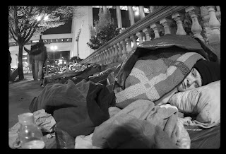
I have been inspired by the Listening Project Capstone class I am taking this fall to create an info kit and resource guide addressing the issue of homelessness in Portland.


OBJECTIVE:
  • Making homeless people visible; raising awareness of the homeless situation and how to deal with it in a positive manner.
  • The goal of my project is to produce a small boxed "kit" containing materials and information to be used by people to further their understanding of homelessness in downtown Portland, and to provide a few valuable resources to those currently living in that circumstance. Maps and other stowable foldout information pieces detailing a timeline of homeless issues, relevant socioeconomic statistics, available resources for Portland street living, and some solid personal accounts and recommendations from the people living this reality would be contained in a sturdy, weatherproof box/container of a carryable size and weight. Certain small staple survival supplies may also be contained within it.

The container would have two chambers/categories:

  • LEARN : Information about local homeless statistics, history, psychological impact, current social/governmental efforts to manage the issue of homelessness. Maps, charts, small text-rich pieces with accompanying photos/illustrations. To be used by those curious about the problem, and those currently living on the street.

  • USE : Rubber-meets-road information and materials detailing metro resources available to assist those experiencing homlessness. These would include lists and locations of shelters, food and hospitality centers, restrooms, social and medical services available from area agencies, transit access, current metro ordinances/rules applying to people using the street as their home, among others. Certain small staple survival supplies might also be stashed here. Current homeless individuals can skip right to this section, or those who have experienced the information provided in the LEARN portion of the package can put it to USE in this category.

RESEARCH/DATA COLLECTION:

  • Being involved with the Listening Project Capstone gives me direct and regular contact with and access to the plentiful information resources of the MacDonald Center, a faith-based agency providing assistance to the homeless community in Old Town. I am readily able to interview countless volunteers and administrators, as well as homeless individuals themselves for relevant material to be compiled and presented throughout my project. An audit of graphics and info distribution methods used by other social assistance agencies will also be conducted and documented.

AUDIENCE:

  • My targets are those curious wanting to learn more about and take action to alleviate homelessness in Portland, and those newly or currently experiencing homelessness. Polling members of the public and interviewing homeless individuals comprises their participation. Use of the materials and resources contained in the BlockBox is also participation-heavy (via games/exercises).

DELIVERABLES:

  • A sturdy, weatherproof box containing:
  • a waterproof map of downtown Portland
  • several fold-out info pieces
  • some small staple survival supplies (toothbrush, soap, etc)


Tuesday, October 13, 2009

Axegrinding: wk 3 read-n-respond


Anything you can do to straighten your path, lighten your load, plot out your course, do it.
Carefully and with some tact. This was the common thread of these three pieces.

The first chapter was a more didactic, diagrammed display of the use of a well-devised organizational plan to structure one's attack on a design problem, through the use of a somewhat cold and complicated matrix, checklist-style. A couple of case examples involving design students in Ohio (land of Devo) highlighted the variations possible in using this matrix. Both results happened because of a little research beforehand, and some testing of the intended audience along the way to pinpoint the direction design efforts should take.

Same thing, a little more specifically explored in the second piece. The generation of a health leaflet doesn't seem that complicated, but you want the most bang for your buck and concise, insured delivery of your message when lives are on the line, so the author detailed basically the same approach as the first piece and how it shaped and refined their work on the leaflet.

Third was the most interesting one to me, although it made some (I thought) preachy assumptions. Not many, more like nuances, but the authors' political heart is on the sleeve. Let the actual audience in, and their native cultural conventions and mechanisms will help deliver your graphic arrow with a little more accuracy and local legibility. Document the whole thing throughout, and you have a tightened procedure in place for future campaigns.

The application of these concepts to what we are trying to accomplish with our termlongs (new word?) is pretty clear. Ask the question, try your solution on some relevant people, refine your approach, and make a more stable and targeted finished piece.

You can always revise later for your portfolio class, right?

Thursday, October 8, 2009

Termlong elaboration


not-so-fun camping

I had originally wanted to make a "kit" or "quickguide" for the non-extreme camper, one who does not gear up at REI and tackle mountains every time they step out into the great outdoors which this region offers aplenty. Slouchcamping, a term my friends and I have coined to describe our loosely-defined method of quick weekend camping trips mostly centered around pitching a tent, starting a fire, cracking open some PBR, and reading cheap horror paperbacks aloud to one another while staring into the flames till s'mores time, was to be the title of this little kit. Humorous and simple to assemble. Slightly educational, and slightly more entertaining. Lighthearted and fun, personal from me to youse.

But I want to tailor this same framework to a different purpose. Slightly less light-hearted, but still kind of fun, while teaching a valuable lesson (or at least engaging the particiant in an interesting experiment). I am currently taking the PSU Senior Capstone called the Listening Project, which teaches you about the issues of homelessness in the Portland metro area, how to acknowledge and listen to those affected by it, and places you in a face-to-face volunteer situation to apply what you are learning.

Seems to me you could take this same "camping kit" approach and change it to a "Day Without A Home". A map and list of places to stay, how to access day/night services, bathrooms, food possibilities, places to avoid, and straight-from-the-horse's-mouth advice on how to make it through the day from those who do it everyday. It would involve interviewing some of the people I encounter in my volunteer placement, and people who work at these facilities. A checklist and journal space in the packet would invite participants to share their thoughts on supporting blog site. One day, or as long as they care to extend the experience. A lesson could be learned, eyes could be opened, and perceptions about the town we all walk through everyday could become clearer. No clear title yet. Still thinking.

Constructivismism


Seems somewhat appropo in this current climate of "socialism" or (whatever buzzword you strap over it) to have Constructivism come to mind. This mechanically driven, anti-individual-pro-universalization school of thought arose from the chaotic aftermath of the first World War as a desperate response to, well, desperation. Careful, methodical, functional, centered; everything Europe (Russia, too) had not been for the last decade or longer. Its emphasis was the merging of art and industry, by which was meant day-to-day productivity and activity. It was stated in the declaration from the International Faction of Constructivists (published in De Stijl no. 4, 1922) that "art [is] a method of organization that applies to the whole of life" and should be used as "a tool of universal progress." Sounds simple, direct, right?

Artists, especially those involved in the more applied, design-y end of things know that it can't be that simple. Certainly it could not have been that simple to a world in transition after the war at the dawn of new century. But its principles, nonetheless could be usefully adapted (assimilated?) into a scaffolding or skeleton around which to structure one's approach in designing for a new and evolving culture. Our current situation here in 21st century America, to say nothing of the global cultural upheaval of which it is but one participant, clearly qualifies for this category; social design can make use of the universalized, semiotically direct approach of the avant garde in the first half of the 20th century.

By using mass means, anonymous structures already in place in our culture, one can find and customize their own niche, thus undermining (enriching?) the utopian limitations of Constructivist anti-individualism. I have stated in an earlier post that Kate Fowle seemed to be pointing this fact out as manifested in the social art creations of Harrell Fletcher. Our recent Skype-versation with Marc Horowitz also underscored this connection, this subversion, albeit in his clipped and quirky humour-laden way.

Signs and signals are important; their design should be left to those who know how to use them, and re-purpose them for the rapidly evolving contexts in which they are to serve their audiences. Make something new out of something the masses already recognize, easing their access, and allowing you to steer them in a new direction subtly.

Monday, October 5, 2009

termlong possibilities

Just peeps, whispers.

"Slouchcamping"
"Listening Therapy"

Details later.

Saturday, October 3, 2009

mutation


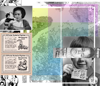
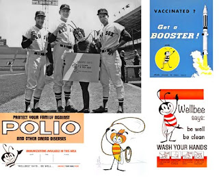
moodboard images from cdc archives


Social practice project undergoing mutation.

After brief but productive team meeting Friday, decided to meld game idea and the clockface concept. Result at present: DesignFlu. My tentative take on the concept is roughly this:
  • a bad design flu bug is out there
  • you don't want to have it
  • there is a countervirus, say, DesignBooster
  • you get this countervirus by going to our site/signing up on a clipboard in hall
  • logon to site, post name.location.date/time.who infected you (if anyone)
  • post one or more "design health" tips (best practices advice)
  • spread to as many people as possible (social network sites useful)

result (reciprocity):
  • amassed tips and wisdom from fellow designers
  • being on the SAFE list.
  • awesome immunization badge


Thursday, October 1, 2009

social practice project start


my beginning contribution to our group Social Practice Project

the idea is finding out what designers would do if they were given one more hour in the day.

in the hall, a poster (not pictured here in the moodboard, nice, huh?) with a blank clockface with 13 numbers that people scribble on the hands and jot down their timewish.

we collect the ideas, add them to our supporting time management blogsite, and turn them into little passports, badges allowing you to do the timewish.

you come to a party event to pick up your passport. Don't like your passport, swap with someone else and learn al little something about them in the process.

supporting deliverables: pins/stickers with the 13 clock, pause button imagery, SLOW traffic signage, etc.

a beginning.

Wednesday, September 30, 2009

Dogs and cheese


A better combination, I hear, than dogs and chocolate.

Of three selections for first reading, the title, Beyond An Appreciation For Dogs, Books, and Cheeses, had immediate appeal for me. It stated

(not in the particular stacking order I would apply, more on that in a minute) three of my favourite things. A personal appeal, a pressing of a pause button on your senses, a doubletake and "hmm?" moment for you, the reader. But you have to read it, and then you have to interpret it, and then you have to go do other things with your day (which doesn't stop moving forward).

Penned by Kate Fowle about artistic exploits of Harrell Fletcher, the piece summarizes and analyzes five creations of his in an effort to demonstrate his approach to navigating the world and aiding others in their navigation. Fletcher's works, she seems to assert, is inward in direction; not necessarily the creation of new matter/structure, but a meandering through existing frameworks of culture and society to find one's niche, one's purpose. Most focus is given to a couple of film projects using Joyce's Ulysses as their template/guide. The use of cue cards from which non-dramatic, real-world gas station employees read direct quotes from the novel creates an sudden portal linking literature directly with the present moment out here in the noisy 3D world, skipping the waystop of interpretation and dumping the material right into your lap. A similar effort followed at a senior center, and another with repetition of what surprises emerge from an unfurling hand. These don't just expand on the same idea, but rather more live within it, nested as folders are in a computer file structure.

This was the overall impression (image?) which kept coming to me as I read the piece. His odd titles, the brevity of his presentation style, invite you to, as it were, click the folder, find another within it, read it, find another or stop. Then, inspired, you may turn and create your own folders, perhaps within his, perhaps within your own. Fowle states, "It is no longer tenable to consider an alternative lifestyle that can function outside of the mainstream culture we are born into." A quick glimpse of Fletcher's method shows this to be possibly true, but not necessarily limiting. With folders within folders, one is not creating a whole new world nobody's ever thought of before; just filling one that is already there with little surprises. It is up to you to open your hand and click on one.

Claimgrab

I claim this blog for Jermany. More to come.